1.Build trust and engage customers
Promotional emails increase your customers’ trust by providing them with real value. It can be a discount, free information, or anything else. This makes them a great tool for converting browsers into customers who will trust you and buy your product or service.
They also generate engagement, giving people an incentive to engage with your content. Additionally, emails that contain content and incentives see the highest click-through rates (CTR), conversions, and customer loyalty.
2. Save money
Most email and SMS marketing providers have reasonable fees that are more affordable than other marketing strategies, such as pay-per-click advertising. Promotional emails are cost-effective promotional tools because they are aimed at audiences who have already shown interest in your products or services through their browsing behavior.
3. Increase your ROI
As promotional emails are targeted to audiences who have already expressed an interest in your company or products, they have the highest return on investment (ROI) of any promotional tool.
These types of emails provide real value to the recipient, which in turn gives them a greater sense of trust and appreciation for your business.
Now that we know what promotional emails are, here are some examples that can help you with your strategy:
1. Apple – Promotional emails for product launches
You planned ahead, studied your market, your audience, and finally developed a product that you consider incredible. How do you introduce it to the world?
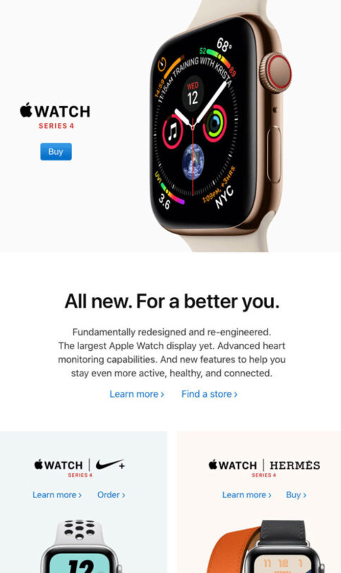
This promotional email from Apple shows that even major global brands need marketing strategies and follow rules like any other company.
Removing distractions and clutter around the CTA button produces better results and it’s no surprise to see this strategy employed here. It allows the reader a clear path to what you’re trying to sell them.
Combining stunning visuals with a clear action button and a subject line that focuses on benefits, Apple gets it right.
Key Takeaways:
● Clean design with no distractions
● Clear and well defined CTA
2. Grammarly – Promotional emails that offer big discounts
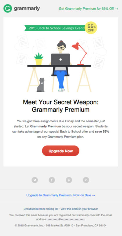
Grammarly presents another great example of how promotional emails are used to get new or returning customers.
For the students, this email uses the classic sales technique of presenting a known problem, then offering solutions to solve it. 70% of people buy a product to solve a problem. Grammarly uses this to their advantage. The illustration here is great because it’s attractive and clean, and it’s in keeping with the overall message: it allows the user to read the email in seconds and focus on the main offer: a whopping 55% discount off their Premium product. Also, note that just like in the Apple example, the Call to Action button is unobstructed.
Highlights:
● Presenting a problem and then offering the solution
● Design that allows the user to quickly understand the message
3. Dropbox – Promotional emails that reconnect with inactive customers
Customer retention should not be underestimated. It costs significantly more to bring a new customer in than it does to retain existing ones. How does one “win back” customers who have become inactive?
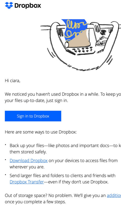
This example from Dropbox combines humor and creative branding images, and a concise message that highlights their best features. It uses this humor to remind the customer of one of the fears the modern workforce faces; losing those precious files and photos we forgot to back up. The ad does this without blatantly fear mongering, which is important. It simply mentions that you can “restore your stuff in a snap even if your computer melts down.”
Highlights:
● Humor as a way to win back inactive customers
● Use the fear trigger in a discreet and non-threatening way
4. Starbucks – 3×1 Email
It’s not surprising to see a great email from Starbucks. They send some of the best promotional emails out there.
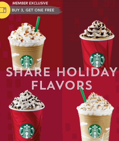
In this email, which is only sent to members, they offer a “buy three and get one free” offer for a very limited time. Almost all Starbucks offerings are time-sensitive. This is because they need people to actually visit the stores and not just order online. This also creates a “fear of missing out” in the consumer.
Highlights:
● Time-sensitive content creates a sense of urgency
● Image that reinforces the benefit obtained by the customer
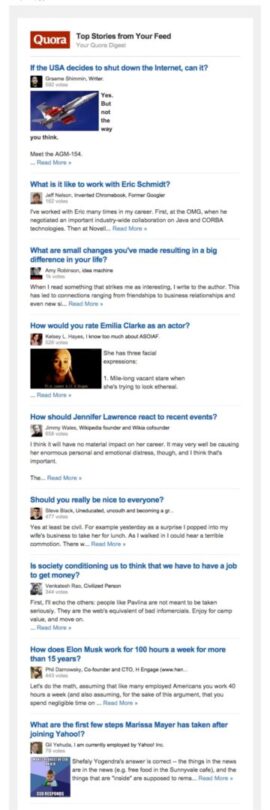
5. Quora – click-bait promotional email
Quora usually works a lot with user generated content, meaning the content on the website is created by the platform users themselves.
Each newsletter arrives with a feed question, which means the topic will generally be interesting and can cover a variety of subjects. You never know what you will get with a Quora promotional email, but it’s always worth checking out.
Our highlights:
● Take advantage of the topics most commented on by users
● Using curiosity as a click-bait
6. Airbnb – Personalized Emails
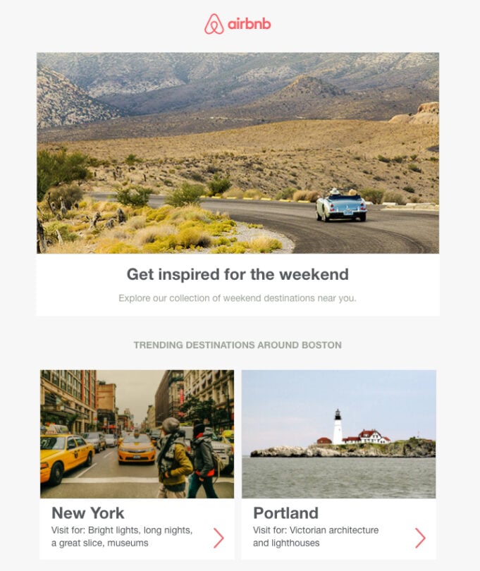
Airbnb describes itself as “A community based on trust”, and has built a strong reputation that supports it.
Their promotional email below is a great example for a number of reasons, but right off the bat what stands out is the use of personalization.
Personalization starts with the subject line and they use not one, but two personalized lines with basic replacement tags (username and hometown). Knowing that the email contains personalized information, the reader feels more motivated to open it.
This email campaign takes full advantage of the data on which the company relies to provide useful information to the user.
Highlights:
● The use of personalization already in the subject of the email
● The way they use the data to provide something relevant to the reader
7. Canva – Promotional email with only one link
The design site Canva uses a simple email with no teasers and only one link. Making it short, and to the point.
They use a line of text to capture the reader’s attention and then follow it with a link to read the content. Again, the minimalist style of this email is great because the reader knows what they are looking at.
Our highlights:
● The captivating question from the beginning
● The design, after all, is their product.

Now that you are more familiar with promotional email marketing, it’s time you take advantage of it to grow your business by using our best email sending service. Click the link below to find out more about what we offer.
